You are here: Reference > Rule types > Skins > Skin form — Controls — Text inputs & Formatted text
Styles set here apply to the following types of text:
- field text — text that a user types in a text input field (
pxTextInput) or a text area ( pxTextArea)
- placeholder text
- error text that displays on an input field
- character counter text
- read-only text
- purpose-specific fields
You can define the Standard style or create additional style formats.
A preview of the currently selected format displays to the right. You can also preview formats by clicking Run in the toolbar and selecting one of the following preview options: Run Process, Open Portal, Harness Preview, UI Gallery Preview, Skin Preview. In the Skin Preview, select the Controls tab.
| Same formatting for Field, Error, Remaining Counter, and Read-Only Text
|
Applies the same settings to Field, Error, Remaining Counter, and Read-Only Text. Clear this check box to define styles for each of these elements individually. Additional fields appear. |
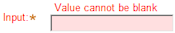
At run time, Error Text displays above the input field only if the value of Display Field-Level Errors, on the Display Options tab of the harness rule, is set to Displayed as Full Error Text. To see this in the Skin Preview, click in the Input field in the top panel, and then click a tab.
If the value of Display Field-Level Errors in the harness rule is set to Displayed as Image with Tooltip, then the error message displays as tooltip using styles set in General>Errors. See Skin form — Components tab — General — Errors.
Define the appearance of the text for Field Text, Error, Remaining Counter (for text area controls only), and Read-Only Text.
Text
| Use mixin
|
Select to use a mixin to define the appearance of this element. The Mixin field displays the name and a preview of the currently selected mixin. Click the gear icon to select a different mixin from the list.
- Mixin overrides — Click Add mixin override to override a style set by the mixin:
- Font — Select the font family. The font family defaults to (use overall), which is the font you specified in the Overall Font field at the top of the Mixins tab.
- Font Size — Select the font size in pixels (px), points (pts), em (the current font size), or percentage (%).
- Color — Enter a hexadecimal value (such as #3d3d3d) or click the box next to the field to Choose a Color.
- Font Weight — Select a font weight from the list.
- Text Decoration — Select a text decoration option from the list, if desired. For example, Underline. The blank selection indicates that no additional attributes are applied.
- Transform Text — Select a text transformation option from the list, if desired. For example, Lowercase. The blank selection indicates that no additional attributes are applied.
- Additional styles — Add additional styles, specific to styling the text for this element, by specifying a CSS Attribute and Value. Specify only CSS related to text styles. Click Add additional styles to define another CSS attribute-value pair. Click delete to remove an additional style.
|
| Specify styles
|
Select this check box to define a custom text format:
- Font — Select the font family. The font family defaults to (use overall), which is the font you specified in the Overall Font field at the top of the Mixins tab.
- Font Size — Select the font size in pixels (px), points (pts), em (the current font size), or percentage (%).
- Color — Enter a hexadecimal value (such as #3d3d3d) or click the box next to the field to Choose a Color.
- Font Weight — Select a font weight from the list.
- Text Decoration — Select a text decoration option from the list, if desired. For example, Underline. The blank selection is the default, for backward compatibility, and indicates that no additional attributes are applied.
- Transform Text — Select a text transformation option from the list, if desired. For example, Lowercase. The blank selection is the default, for backward compatibility, and indicates that no additional attributes are applied.
- Additional styles — Add additional styles, specific to styling the text for this element, by specifying a CSS Attribute and Value. Specify only CSS related to text styles. Click Add additional styles to define another CSS attribute-value pair. Click delete to remove an additional style.
|
Placeholder Text Color
| Color
|
Enter a hexadecimal value (such as #3d3d3d) or click the box next to the field to Choose a Color for the placeholder text. Use the Placeholder setting in the control parameters dialog to specify the text that appears.
|
Border and Background
Define the border and background of Field and Error.
| Use browser styles for border and background
|
To take advantage of styling features built into browsers (suggested), select this check box.
Clear this check box to override the browser styles and specify settings for field and error borders and backgrounds. Additional fields display.
|
Field Border and Error Border
As a best practice, select the Use browser styles for border and background check box to take advantage of styling features built into browsers, rather than specifying border styles.
| Use mixin
|
Select to use a mixin to define the appearance of this element. The Mixin field displays the name and a preview of the currently selected mixin. Click the gear icon to select a different mixin from the list.
If desired, you can specify the Top, Left, Right, or Bottom border as none, solid, dashed, or dotted , rather than inheriting the style from the selected mixin.
|
| Specify styles
|
Select to define a custom border:
- Apply to all sides — select this checkbox to specify the same border style to the top, left, right, and bottom borders. Choose from none, solid, dashed, or dotted.
- If you clear the Apply to all sides checkbox, select a border style for the Top, Left, Right, and Bottom borders. For each of these borders, you can select none, solid, dashed, or dotted. Specify the pixel width and color of the border, if applicable.
|
Field Background and Error Background
As a best practice, select the Use browser styles for border and background check box to take advantage of styling features built into browsers, rather than specifying background styles.
| Use mixin
|
Select to use a mixin to define the appearance of this element. The Mixin field displays the name and a preview of the currently selected mixin. Click the gear icon to select a different mixin from the list.
|
| Specify styles
|
Select this check box to define a custom background:
Select the background Type:
- none — Indicates no background color, similar to setting a transparent background.
- solid — Enter a hexadecimal value (such as #3d3d3d) or click the box next to the Color field to Choose a Color.
- gradient — Select the Direction in which you want to blend the background colors, horizontal or vertical. Specify the Start and Stop colors of the gradient. Specify a Backup color, in the event that the browser cannot render the gradient.
- image — Specify the following:
- Background color — to use the background color specified in a mixin; choose obtained from mixin and then click the gear icon to select the mixin. Alternatively, you can select custom color and enter the CSS hexadecimal value or click the box next to the field to Choose a Color.
- Location — Enter the location of the file, including the relative path. For example,
images/AlphaCorpLogo.png.
To search for an image, click ( ) to open the Image Catalog tool. Enter any portion of a file name (relative path, file name, or extension) in the Search box, and click Find. If you can’t find the image, make sure it is in the ) to open the Image Catalog tool. Enter any portion of a file name (relative path, file name, or extension) in the Search box, and click Find. If you can’t find the image, make sure it is in the webwb directory. - Tile — Specify tile settings for the image. Select
None if you want to use a single image; Horizontal if you want a row of images in the background; Vertical, if you want a column of images in the background, or Both, if you want rows and columns containing the image in the background. - Position — Specify the placement of the starting tiled image, for example, top left.
- Additional styles — Add additional styles, specific to styling the background for this element, by specifying a CSS Attribute and Value. Specify only CSS related to background styles. Click Add additional styles to define another CSS attribute-value pair. Click delete to remove an additional style.
|
Creating a custom format
You can create custom text input formats that you can apply within your application.
To create a new style format:
- Click Add a format.
- In the Create a new format dialog, type the Format name using only alphanumeric characters (a-z and 0-9) and spaces. The name cannot begin with a number. The style name that you enter is converted into the name CSS class/classes.
- Type a Usage annotation, if desired.
- Click OK. The new format is populated with default values.
If you want to create a new format that is a copy of an existing format, right-click the format that you want copy and then click Clone.
Applying a custom format
- Click (
 ) to open the Cell properties panel.
- On the Presentation tab, press the down arrow in the Style field to select the custom format that you want to use.
About Skin rules
Open topic with navigation
