You are here: Reference > Rule types > Skins > Skin form - General - Panel Set - Header
Skin form — Components tab — General — Panel Set
|
|
- Header
- Body
|
Beginning with 7.1, panel sets are deprecated. As a best practice, upgrade panel sets to screen layouts.
Screen layouts are available only to user interfaces rendered in HTML 5 document type (standards mode).
Existing panel sets will continue to function, but you cannot create a new panel set in applications rendered in HTML 5 document type (standards mode). You can create new panel sets in Quirks mode.
Styles set here apply to the header and footer of the panel set.
A preview of the currently selected format displays to the right. You can also preview formats by selecting Actions > Launch in the toolbar and then choosing one of the following preview options: Run Process, Open Portal, Harness Preview, UI Gallery Preview, Skin Preview.
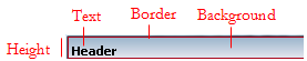
Applies to the Text within the panel set header and footer.
| Use the same formatting for Expanded and Collapsed headers
|
Applies the same settings to expanded and collapsed headers. Clear this check box if you want define different styles for expanded and collapsed headers. Additional fields appear. |
Text
Applies to the Text within the panel set header and footer.
| Use mixin
|
Select to use a mixin to define the appearance of this element. The Mixin field displays the name and a preview of the currently selected mixin. Click the gear icon to select a different mixin from the list.
- Mixin overrides — Click Add mixin override to override a style set by the mixin:
- Font — Select the font family. The font family defaults to (use overall), which is the font you specified in the Overall Font field at the top of the Mixins tab.
- Font Size — Select the font size in pixels (px), points (pts), em (the current font size), or percentage (%).
- Color — Enter a hexadecimal value (such as #3d3d3d) or click the box next to the field to Choose a Color.
- Font Weight — Select a font weight from the list.
- Text Decoration — Select a text decoration option from the list, if desired. For example, Underline. The blank selection indicates that no additional attributes are applied.
- Transform Text — Select a text transformation option from the list, if desired. For example, Lowercase. The blank selection indicates that no additional attributes are applied.
- Additional styles — Add additional styles, specific to styling the text for this element, by specifying a CSS Attribute and Value. Specify only CSS related to text styles. Click Add additional styles to define another CSS attribute-value pair. Click delete to remove an additional style.
|
| Specify styles
|
Select this check box to define a custom text format:
- Font — Select the font family. The font family defaults to (use overall), which is the font you specified in the Overall Font field at the top of the Mixins tab.
- Font Size — Select the font size in pixels (px), points (pts), em (the current font size), or percentage (%).
- Color — Enter a hexadecimal value (such as #3d3d3d) or click the box next to the field to Choose a Color.
- Font Weight — Select a font weight from the list.
- Text Decoration — Select a text decoration option from the list, if desired. For example, Underline. The blank selection is the default, for backward compatibility, and indicates that no additional attributes are applied.
- Transform Text — Select a text transformation option from the list, if desired. For example, Lowercase. The blank selection is the default, for backward compatibility, and indicates that no additional attributes are applied.
- Additional styles — Add additional styles, specific to styling the text for this element, by specifying a CSS Attribute and Value. Specify only CSS related to text styles. Click Add additional styles to define another CSS attribute-value pair. Click delete to remove an additional style.
|
Border
Applies to the border around the panel set header and footer.
| Use mixin
|
Select to use a mixin to define the appearance of this element. The Mixin field displays the name and a preview of the currently selected mixin. Click the gear icon to select a different mixin from the list.
If desired, you can specify the Top, Left, Right, or Bottom border as none, solid, dashed, or dotted , rather than inheriting the style from the selected mixin.
|
| Specify stylesSelect to define a custom border
|
:
- Apply to all sides — select this checkbox to specify the same border style to the top, left, right, and bottom borders. Choose from none, solid, dashed, or dotted.
- If you clear the Apply to all sides checkbox, select a border style for the Top, Left, Right, and Bottom borders. For each of these borders, you can select none, solid, dashed, or dotted. Specify the pixel width and color of the border, if applicable.
|
Background
Applies to the background of the panel set.
| Use mixin | Select to use a mixin to define the appearance of this element. The Mixin field displays the name and a preview of the currently selected mixin. Click the gear icon to select a different mixin from the list. - Additional styles — Add additional styles, specific to styling the text for this element, by specifying a CSS Attribute and Value. Specify only CSS related to text styles. Click Add additional styles to define another CSS attribute-value pair. Click delete to remove an additional style.
|
| Specify styles | Select this check box to define a custom background: Select the background Type: - none — Indicates no background color, similar to setting a transparent background.
- solid — Enter a hexadecimal value (such as #3d3d3d) or click the box next to the Color field to Choose a Color.
- gradient — Select the Direction in which you want to blend the background colors, horizontal or vertical. Specify the Start and Stop colors of the gradient. Specify a Backup color, in the event that the browser cannot render the gradient.
- image — Specify the following:
- Background color — to use the background color specified in a mixin; choose obtained from mixin and then click the gear icon to select the mixin. Alternatively, you can select custom color and enter the CSS hexadecimal value or click the box next to the field to Choose a Color.
- Location — Enter the location of the file, including the relative path. For example,
images/AlphaCorpLogo.png.
To search for an image, click ( ) to open the Image Catalog tool. Enter any portion of a file name (relative path, file name, or extension) in the Search box, and click Find. If you can’t find the image, make sure it is in the ) to open the Image Catalog tool. Enter any portion of a file name (relative path, file name, or extension) in the Search box, and click Find. If you can’t find the image, make sure it is in the webwb directory. - Tile — Specify tile settings for the image. Select
None if you want to use a single image; Horizontal if you want a row of images in the background; Vertical, if you want a column of images in the background, or Both, if you want rows and columns containing the image in the background. - Position — Specify the placement of the starting tiled image, for example, top left.
Select the background Type: - none — Indicates no background color, similar to setting a transparent background.
- solid — Enter a hexadecimal value (such as #3d3d3d) or click the box next to the Color field to Choose a Color.
- gradient — Select the Direction in which you want to blend the background colors, horizontal or vertical. Specify the Start and Stop colors of the gradient. Specify a Backup color, in the event that the browser cannot render the gradient.
- Additional styles — Add additional styles, specific to styling the background for this element, by specifying a CSS Attribute and Value. Specify only CSS related to background styles. Click Add additional styles to define another CSS attribute-value pair. Click delete to remove an additional style.
|
Height
Sets the height of the panel set header and footer.
| Height | Specify the height of the panel heading bar by entering a value in pixels. |
About Skin rules
Open topic with navigation
