Skin form — Components tab — Controls — Split/menu button |
|
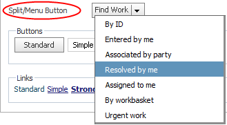
The presentation of a Split/Menu button is determined by a combination of styles. The button settings, for example, text and background, use the Standard Button styles. The menu presentation is determined by settings you specify here.
To preview changes, save the rule and click Run ( ). In the Skin Preview, select the Controls tab.
| Use mixin |
Select to use a mixin to define the appearance of this element. The Mixin field displays the name and a preview of the currently selected mixin. Click the gear icon to select a different mixin from the list. If desired, you can specify the Top, Left, Right, or Bottom border as none, solid, dashed, or dotted , rather than inheriting the style from the selected mixin. |
| Specify styles |
Select to define a custom border:
|
Rounded corners
| enable rounded corners (HTML5 only) |
Select this check box if you want the border of the overlay to have rounded corners when rendered in HTML5 Document Type. You can select this option when using a mixin or a custom border. For information about rendering your application in HTML5 Document Type, see HTML5 Application Readiness. |
| same for all corners |
Select to use the rounded corner settings that you specify in the Unit and Radius fields for all four corners or clear to specify the length of the x and y axis for the Top Left, Top Right, Bottom Left, and Bottom Right. |
| same x and y axis radii |
Select to specify x and y radii of the same length. If you clear this check box, specify the length of the x and y axis for the Top Left, Top Right, Bottom Left, and Bottom Right. |
| Unit | Select the unit of measurement for the rounded corner settings: pixels (px), em (the current font size), or percentage (%). |
| Radius |
Define the curve of rounded corners by specifying the x (hortizontal) and y (vertical) radii of the quarter ellipse that makes the rounded corner of the overlay. |
| Use mixin |
Select to use a mixin to define the appearance of this element. The Mixin field displays the name and a preview of the currently selected mixin. Click the gear icon to select a different mixin from the list.
|
| Specify styles |
Select this check box to define a custom background: Select the background Type:
|

|
Skin rules — Completing the Components tab |
 ) to open the Image Catalog tool. Enter any portion of a file name (relative path, file name, or extension) in the Search box, and click