You are here: User interface > User interface rules > Harness and section forms > Harness and Section forms - Adding a Grid layout
Harness and Section forms - Adding a Grid layout
A Grid layout presents data in aligned columns and rows, as a spreadsheet. Grids are highly performant and can display expansive data sets using progressive paging. There are numerous options for configuring read-only and editable grids.
Using grid layouts, users can view (and in certain cases edit) values of a Data Page, Page List or Page Group property, or a report definition, in a spreadsheet format. The layout can display a custom skin; is cross-browser compatible; is sortable by column; fields can be configured to be editable and localizable.
The grid is created dynamically, and will have as many rows as needed to display the requested data.
The grid may be read-only, simply displaying property values. You may specify that the data can be edited in a number of ways:
- All the editable fields may be displayed as editable, as in a spreadsheet
- Editable fields in a row become editable when a user clicks on that row
- A modal dialog appears with the editable fields for a row when the user clicks on that row
Depending on parameters, users may be able to add or delete rows, to reorder rows, and to apply actions to rows by clicking action buttons. The action buttons may appear in areas above or below the data. Action buttons can appear in each row, or only in the row that the user has clicked.
When a grid is bound to a data page or report definition that accepts parameters and the parameter value uses a property reference, the grid automatically refreshes whenever the property value changes.
Note: If the source for the grid is a report definition, and the Header display field on the Report Definition Report Viewer tab is set to "Hide column headings", the column headings do not appear in the grid.
Adding and configuring a Grid layout
- In the section, click
 and select
  .
.
- On the Set layout type dialog, select Repeating layout.
Note: Dynamic layouts do not support grid layouts. To see the Grid option for Repeating layout, insert the Layout control directly in a section.
- In the drop-down list, select Grid, and then click OK.
- Click
 in the Grid Repeat Layout to open the Properties panel.
-
In the Properties panel, define the drop-down list using the following tabs:
You can also set properties for columns, rows, and action areas.
You can also add a grid layout by dragging the Page List, Page Group, Data Page, or Report Definition that you want to use as the data source from the Application Explorer into the section. You can reference a Page List embedded in any of level of pages; for example Page.Page.PageList.
Note: The UI Gallery contains working examples of grid layouts. To view and interact with examples and review configurations, select Designer Studio > User Interface > UI Gallery. Explore the examples in the Tables & Grids category.
How to use the properties panels
You configure many elements in a grid layout using properties panels. To display the panels, select an element and click  . To select an element, click the following:
- Sections — a header label on a wire frame
- Rows and columns — a circle (o) next to or on top of a cell
- Cells — inside a cell
Property fields may appear at the top of the panel or in one or more tabs. If the panel is pinned  , click Apply to apply your changes. Click the red x at the top right of the panel to close it. If the panel is not pinned, click Apply to apply your changes and continue editing, or OK to apply your changes and close the panel.
Parts of a Grid layout
The Grid layout has three areas:
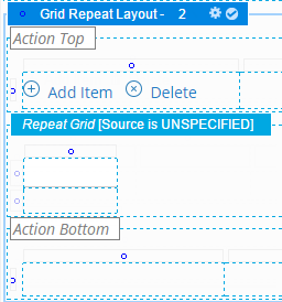
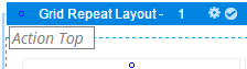
- Layout area — The framework that contains the action and repeating areas. You define the header format, header type, and overall width.
- Action areas — The top and bottom areas in which you can place buttons or other controls linked to actions, such as Add Item or Delete. The default Grid actions are stored in the template rule, pzPegaDefaultGridIcons, which you can copy and modify to create your own configurations. See Section and Flow Action forms — Adding a Button Control. To remove the default actions, clear the cell.
Note: Applications created before PRPC Version 6.3 do not use the pzPegaDefaultGridIcons template rule.
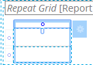
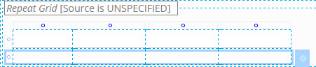
- Repeating area — Between the action areas the system displays information dynamically created from the data source. The first row in this area holds column headers representing the data source fields. The second row repeats as needed to display the requested data. You do not manually add or delete rows here.
You can add or remove columns, specify what fields of the data source to include in what columns, or configure the data's appearance. You can place action buttons in the repeat row to provide quick access to actions that do not require further user input such as "Quick Approve" or "Flag for Review". You can insert radio buttons or check box controls in fields to simplify data entry.
Column properties
Select a column in the repeating area and open its properties panel.
| Width
|
Select to specify the width of this column in pixels. You can also adjust the width of a column directly:
- Hover the mouse pointer over the cell border.
- When the pointer changes shape
 , drag the border to adjust the column width. , drag the border to adjust the column width.
|
| Inline Style
|
Optional: Override the stylesheet settings in this cell with local values.
Enter CSS code for an inline style for a cells in the column. For guided assistance in composing a style definition, click to open the Style Editor. You can select from predefined lists or type a style definition directly, and preview the results.
|
| Filtering
|
Appears if the Filtering check box is selected on the Repeat Grid panel. Select a filtering option for this column:
- Auto — Displays a check box for each unique value and the search or date range fields, depending upon the column data type. This is the default.
- List Only — Displays a check box for each unique value and the search or date range fields, depending upon the column data type. This is the default.
- Range/Search — Displays only the search or date range fields, depending upon the column data type. Use this option to enable search or date range on columns in which the value of each row is unique, for example, a description column.
- None — No filtering is available on this column.
|
| Filter by
|
Appears if the Filtering check box is selected on the Repeat Grid panel. Select a filter by option for this column:
- Value — Filters the column based on the value of the cell content.
- Format — Select a property reference.
|
| Enable Sorting
|
Appears if the Enable Sorting check box is selected on the Repeat Grid panel. This is checked by default. Clear to disable sorting on this column.
|
| Categorize by this column
|
Appears if the Categorize grid rowscheck box is selected on the Repeat Grid panel. Configure the grid column. Select if you want categorize grid rows based on this columns within the grid. You can select the columns by which you want to categorize the grid, and specify sorting and ascending or descending order
Note: Categorizing all columns within a grid would not yield any data columns at runtime.
|
| Importance
|
Appears if the Responsiveness field is enabled on the Repeat Grid panel. Select an importance level for the column. Importance determines which columns display first when a responsive breakpoint is reached. Only one column can have primary importance. This column appears before all secondary columns.
When responsive breakpoint is reached at runtime, the columns marked Other are dropped first. At a second responsive breakpoint, the remaining columns are converted to a list, with the Primary column being displayed in the a heading.
Any unmarked columns are treated with Secondary importance.
|
| |
|
Row properties
Select either row in the repeating area and open its properties panel.
|
Height
|
Enter a positive number for the height in pixels of this cell. (At runtime, normal browser processing for rendering tables determines the actual displayed height.) You can also adjust the height of a row directly:
- Click a horizontal wireframe cell border.
- Wait until the pointer shape changes
 , then drag the border. , then drag the border.
|
| Inline Style
|
Optional. Open the Style Editor panel for this cell to override the stylesheet settings with local values. |
| Make Header?
|
Select to display all the cell values in the row with the same style that the column heading uses. |
Cell properties

Select a cell from the second row in the repeating area and open its properties panel.
| Property
|
Select a Single Value property. Typically, this is from within data source's embedded page property. Alternatively, you can drag a property name from the properties visible in the Application Explorer onto the cell.
If the source is a report definition, the list contains Column Name properties defined in the rule. If there are joins in the report, property names appear as joinname.PropertyName.
Note: This field does not appear if the value in the Control field contains an Action mode control such as pxButton.
|
| Default value
|
Optional. Enter a constant value for the property value, a property reference, or an expression, to be used only when the user form or flow action form appears in read-write mode rather than read-only mode.
Click  to start the Expression Builder. to start the Expression Builder.
Note: Choose a default value that speeds data entry. When the system renders a harness or section in read-only mode (for example because the read-write mode requires a privilege that the current user does not hold), the default value does not appear, because data entry is not permitted.
|
| Visibility
|
To control the visibility of the accordion header, select one of the following:
- Always — the section is always visible
- Choose If Not Blank, or If Not Zero to have the field appear or be hidden based on the property value at the time this area of the user form (section or flow action) is first presented or refreshed. This condition is checked only once.
- Conditional — the section is visible, depending upon a when condition rule or an expression. If you select this option, enter one of the following on the field that displays:
- The When Name key part of a when condition rule. Click(
 ) to review or create the rule. ) to review or create the rule. - Simple expression based on the comparison of a pair of constants, properties, or both, combined by Boolean operators, such as .Color="Red". You can combine the expression with a when condition rule or another expression using the && and || operators.
As a best practice, use the Condition Builder to edit this field. Click ( ) to open the tool. See Using the Condition Builder to configure dynamic UI actions. ) to open the tool. See Using the Condition Builder to configure dynamic UI actions.
Note: If this section is to become part of navigation in a composite portal, you can make the header visible only when a specific space is the current space. Enter an expression here similar to the following:
pyCurrentSpace=="ASpaceName"
Then select the Run visibility condition on client check box. |
| Disable
|
Select to disable the text input:
- Never: never disabled
- Always: always disabled
- Condition (expression): the text input is disabled under the specified condition. In the field that displays, select a condition or click
 to open the Condition Builder. You can define a simple expression based on the comparison of a pair of constants, properties, or both, combined by Boolean operators, such as .Color="Red". You can combine the expression with a when condition rule or another expression using the && and || operators. to open the Condition Builder. You can define a simple expression based on the comparison of a pair of constants, properties, or both, combined by Boolean operators, such as .Color="Red". You can combine the expression with a when condition rule or another expression using the && and || operators.
- Condition (when): the text input is disabled under the specified condition. In the field that displays, select a when rule. Click
 to create a new when condition or review an existing when condition. to create a new when condition or review an existing when condition.
|
| Show When Active
|
This check box appears when control is placed in the repeating area of a Grid, Tree Grid, or Tree layout. If checked, the icon displays in the row only when the user selects it. |
| Required
|
Select to require the user at runtime to enter a non-blank value for the corresponding property. If selected and the field is blank at runtime when the form is submitted, the system associates the message:
This field may not be blank.
with the property.You cannot override this message.
If not selected, the blank value is allowed.
Note: Do not select the Required? check box for a field that appears at runtime as a check box, because the cleared (unchecked) value may correspond to blank.
|
| Control
|
Select a control to format the value in this cell. If left blank, the property uses the control (if any) in the Control field on the property form's General tab.
Many controls on the Basic and Advanced groups are associated with default controls based on the property type. When you drag and drop a control into the cell, the rule appears in this field. For example, the Button control populates the field with pxButton, the Text Area control with pxTextArea, and so on. |
| Behavior
|
Click the magnifying glass beside this field to display the Client Event Editor, where you can specify formatting conditions and actions for this field. For general information on this capability, see Harness and Section forms Help — Client Event Editor. Note: This field does not appear if the value in the Control field contains an Action mode control such as pxButton. |
|
The delete icon appears at the right of the repeating row in this area, to indicate how and where it appears at runtime. Do not use it to attempt to remove cells or rows while editing the layout.
Cell Presentation Properties
Field
|
Description
|
| Advanced Presentation Options |
| Note: As a best practice, define custom styles in the skin. |
| Cell width
|
Specify the width of the column in pixels. Provides the same control as the Width setting in the Column properties panel. |
| Cell height
|
Specify the height of the cell in pixels. Provides the same control as the Height setting in the Row properties panel. |
| Cell read-write classes
|
Specify a default value for this field. Click the magnifying glass beside it to display the Expression Builder, where you can select or create an expression to generate the default value. Leave the field blank if it does not require a default value. |
| Cell read-only classes
|
Optional. Type the name of the custom style, for example, custom_stylename, that you want to apply to this cell when the user form or flow action form appears in read-write mode. Define custom styles in the Skin rule. See Skin form — Custom. |
| Cell inline style
|
Optional. Type the name of the custom style, for example, custom_stylename, that you want to apply to this cell when the user form or flow action form appears in read-only mode. Define custom styles in the Skin rule. See Skin form — Custom. |
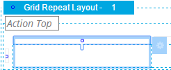
Action area properties
The Grid layout has two action areas, one at the top and one at the bottom of the display. You can use one or both.
If you use both, configure each action area separately.
Select Action Top or Action Bottom, then display the properties panel. Select a column header and open its properties panel.
| Visible When
|
Optional. To control the visibility of the area, enter or select one of the following:
- The When Name key part of a when condition rule. Click
 to review or create the rule. to review or create the rule. - Simple expression based on the comparison of a pair of constants, properties, or both, combined by Boolean operators, such as .Color="Red". You can combine the expression with a when condition rule or another expression using the && and || operators.
As a best practice, use the Condition Builder to edit this field. Click to open the tool. See Using the Condition Builder to configure dynamic UI actions. |
| Run on Client?
|
Appears when you enter a simple expression in the Visible When field. Select to cause dynamic execution of the condition each time the value of a property stated in the condition changes. |
Advanced tab
| ID
|
Optional. Provide an identifier for this grid, for JavaScript use. Start with a letter, use no spaces, and include only alphanumeric characters, hyphens, or underscores. |
Column properties
Select a column in one of the action areas and open its properties panel.
| Width
|
Specify the column width in pixels.
Clear the Set width during execution check box (unlabeled) next to the width field to allow the browser at runtime to determine the width of this column based on the size of the column contents and the size of other columns. The width may vary from use to use depending on the contents of this cell and other cells. (When cleared, the generated HTML for this column includes a <TD> element with no WIDTH= attribute.) The Width value is used as you view the rule form, but not at runtime. For example, clear this check box if the cell is to contain a section that may be wide in some situations and narrow in others. Select (default) the Set width during execution check box to force the Width value to be used by the browser at runtime, even when data values in this column or in other columns would otherwise cause the browser to present a wider or narrower column. If checked, data values may sometimes wrap or appear truncated. |
| Inline Style
|
Optional. Enter CSS code for an inline style for a cells in the column. For guided assistance in composing a style definition, click to open the Style Editor. You can select from predefined lists or type a style definition directly, and preview the results. |
Row properties
Select the row in the top or bottom action area and open its properties panel.

| Height
|
Enter a positive number for the height in pixels of this cell.
Clear the Set height during execution check box (unlabeled) to allow the browser at runtime to determine the height of this row based on the size of the row contents and the size of other rows. The height may vary from use to use depending on the contents of this cell and other cells. (When cleared, the generated HTML for this column includes a <TD> element with no HEIGHT= attribute.) The Height value is used as you update the rule, but not at runtime.
For example, clear this check box if the cell is to contain a section that may be tall in some situations and short in others.
Select the Set height during execution check box to force the Height value to be used by the browser at runtime, even when data values in this column or in other cells would otherwise cause the browser to present a taller or shorter column.
|
| Inline Style
|
Open the Style Editor panel for this cell to override the stylesheet settings with local values. |
| Make Header?
|
Select to display all the cell values in the row with the same style that the column heading uses. This is an alternative to individually selecting the Use Heading Styles check box for each column. This option is unchecked by default. |
Action cell properties
Add a control, property, or other section that is appropriate to the display and function of your data. Configure the section's properties by selecting it and then displaying the properties panel. For buttons, see Section and Flow Action forms — Adding a Button Control.
Tab Group properties panel
When you select a Header Style of Tabbed, the layout appears in a Tab Group wireframe. Select it to make it active and click in the header to open the Tab Group properties panel. Your settings apply to all the tabs in the group.
Complete the top field and General tab. There are no settings on the Advanced tab.
Top field
Field
|
Description
|
| Format
|
Select the styles you want to apply to the tabs in the group. Select:
|
General tab
Field
|
Description
|
| Tab Position
|
Select the placement of the tabs at runtime:
If you select Left or Right, specify the horizontal or vertical orientation of the tabs in the Tab Orientation field
|
| Tab Orientation
|
If you selected a left or right Tab Position, select to display tabs horizontally or vertically. Horizontal is the default. If you select vertical orientation, the tab title is rotated based on the tab position, left or right. |
| Stretch Tabs
|
Select to stretch the horizontally or vertically to fit the available space. If the Tab Position is Top or Bottom, tabs stretch horizontally; if the Tab Position is Left or Right, the tabs stretch vertically. |
About Flow Actions
About Harnesses
About Sections
Open topic with navigation